How Do You Choose a Living Room Colour Palette When You Don't Know Where to Start?
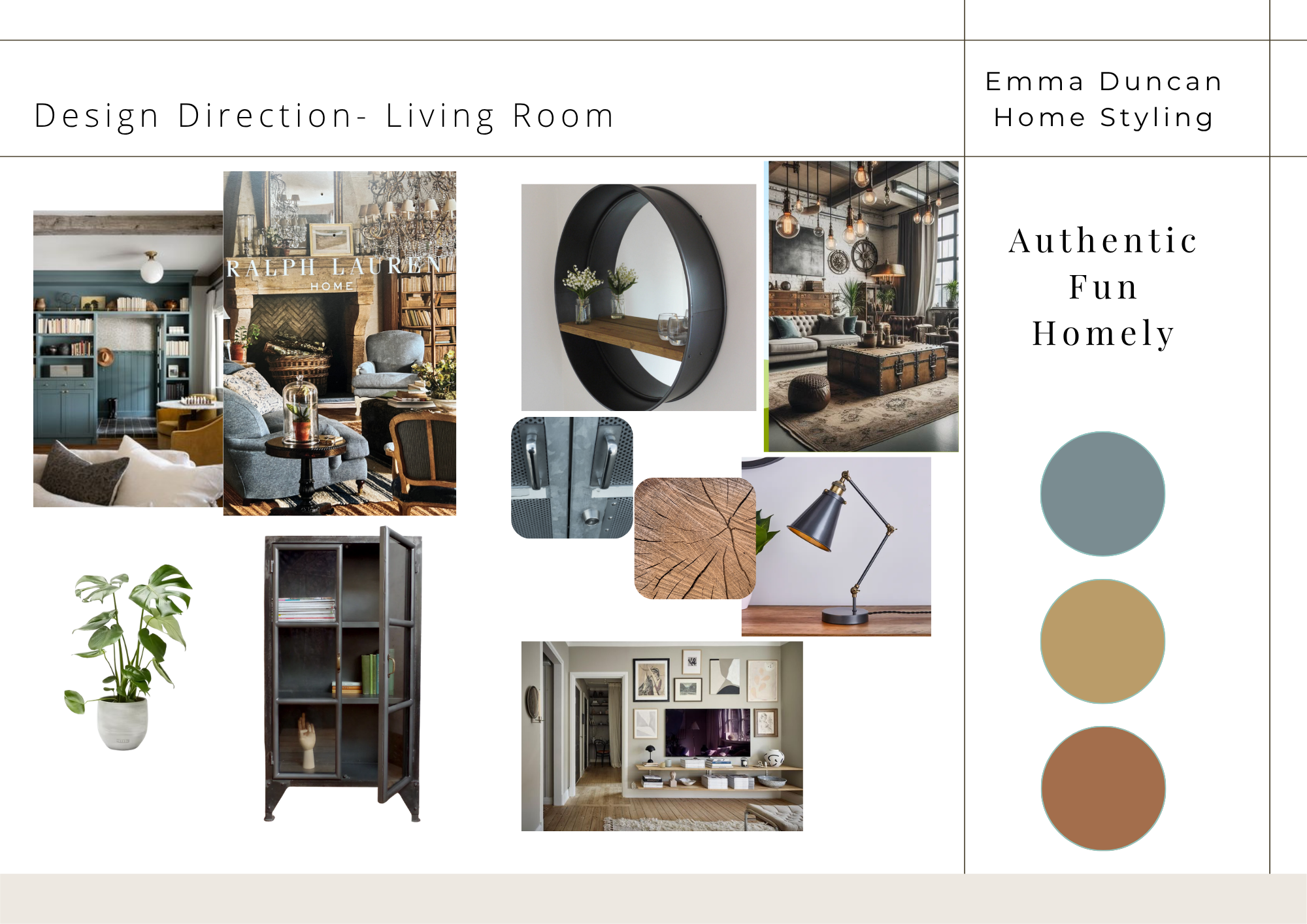
At Emma Duncan Home Styling, we start the design process with understanding the client’s design preferences then get the tone right with a design direction moodboard
The living room of this Berkshire home hadn't changed much since the family moved in some years ago. We can all relate. Family life is busy and without a clear design direction, it's easy to end up overwhelmed by choice and stuck with the same white walls you started with.This family wanted style, pops of colour and personality. They wanted the room to feel finished, elegant and welcoming, but they didn't know how to get there.
That's where our interior styling service comes in. It's designed to guide homeowners from "no idea where to start" to "this is how my home is meant to feel." It's perfect if you have an idea of your own style but need some help putting it into practice. You might have even bought some pieces but you've never felt your home looked truly finished. You know you don't need the expense or complexity of a full-service interior design project but a guiding hand and a professional design eye to back up your choices and give you confidence to complete the project yourself.
Step One: Understanding the Client's Needs
Before we talk colours or furniture, we always begin with a design consultation. This includes a questionnaire on how the family uses the space day to day, a style guide to establish design preferences (do they love industrial, or do they lean more to Japandi?) We talk through what isn’t working, what they love, what they don’t and how they want to feel in the room once it is redesigned.
Choosing a Grown-Up, Calming Living Room Colour Scheme
Our family initially leaned towards Duck Egg Blue. It's a soft, familiar shade, but it can feel a little "child's nursery," or better suited to period properties with strong architectural features. So alongside Duck Egg Blue, we presented a more grown-up, tougher blue, which the family loved.
The final palette was:
Selvedge, a moody, muddier blue from Farrow & Ball
Marmelo, a deep caramel tone
Duster, a soft tobacco yellow
Supporting neutrals including Down Pipe, Lime White and Skimming Stone
For homeowners new to colour, we always recommend a defined and restrained palette of 3 principal colours (with neutrals to support). Why? It creates a coherent flow between rooms and makes future styling decisions much easier, since furniture and accessories can work across multiple spaces as family life changes (which it does).
Adding Texture Without Bold Pattern
The family were wary of bold pattern but we wanted to add texture so the space didn’t feel flat. We recommended sheer textured linen roller blinds to soften light and add privacy to a side window on to a pathway, soft blue herringbone curtains from Jane Clayton for depth without a busy print (curtains are expensive to replace, so keeping them classic pays off), and a soft blue and caramel tartan throw alongside a pink and beige checkerboard rug from John Lewis for understated pattern and texture. These layers now give the room the tactility and comfort that matter, just as much as colour does.
If your living room still feels like a work in progress years after moving in, you're not alone. In Part Two, we'll share how lighting, layout and a blend of personal, vintage and high street touches brought this room to life.
Got some idea of the colours or style you like, but need a second opinion to back your choices and pull it together? My Interior Design Consultation is built for this. We spend an hour working through colour, decor and layout ideas for one room, so you can move forward yourself with confidence. Get in touch to book your in-home design consultation session.
